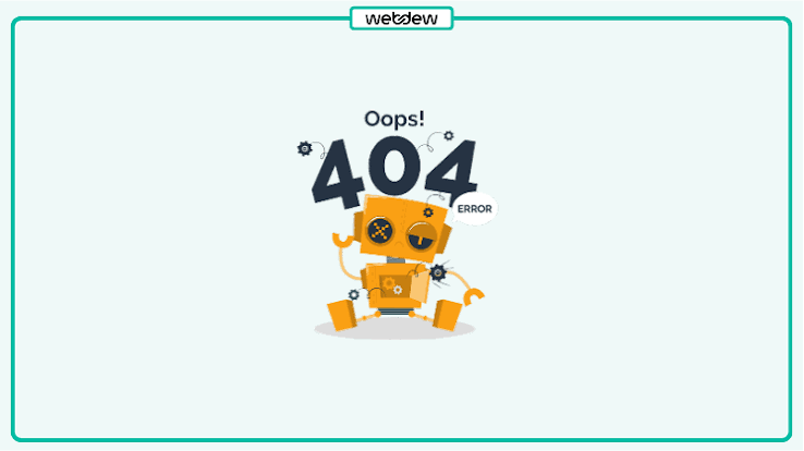
Turning Frustration Into Engagement: Creative 404 Page Designs That Delight Users
Table of Contents
- Importance of 404 Pages
- Key Elements of Effective 404 Pages
- Creative Examples of 404 Page Designs
- Best Practices for Designing 404 Pages
- Conclusion
When users encounter a “Page Not Found” error, they can feel lost or frustrated, often leading them to abandon the site. However, with the right approach, a 404 error can become an opportunity to engage your visitors in creative ways that enhance brand experience. Top websites are now transforming these once-dreaded pages with innovative 404 page designs that not only inform users of the error but also delight and redirect them to relevant content.
Rather than presenting a sterile message, a creative 404 page can leave a lasting impression and demonstrate a brand’s attention to user experience. The secret lies in clear communication, brand consistency, and offering actionable next steps for site visitors. Even if a page is missing, a thoughtfully designed 404 page can encourage users to continue browsing and exploring your site.
With brands putting increasing effort into crafting memorable error pages, users now expect 404 pages to be both functional and fun. These pages offer a perfect canvas for experimenting with humor, storytelling, or brand voice while gently steering users back to helpful resources.
Recognizing the value of a well-executed error page, companies large and small leverage 404 design to keep visitors happy and even garner positive attention on social media. For more inspiration, see this collection of outstanding error page examples featured by Creative Bloq.
Importance of 404 Pages
A user’s journey on your site is rarely linear, and even the best-maintained websites will have the occasional broken or outdated link. When this happens, a generic error message can quickly frustrate visitors and cause them to leave. On the other hand, a well-crafted 404 page captures the user’s attention, recognizes their disappointment, and redirects their intent, effectively lowering bounce rates. According to Network Solutions, a strong 404 page is critical to maintaining professionalism while also expressing the site’s unique personality.
With research suggesting users decide whether to stay or leave your site within seconds of landing on a broken link, the impact of a strategic 404 page extends beyond error recovery. It reassures visitors that you value their experience and are eager to help, thus deepening their trust in your brand.
Key Elements of Effective 404 Pages
To turn an error into an opportunity, the most effective 404 pages focus on the following design principles:
- Clear Error Message: Let users know they’ve hit a dead end in plain, direct language.
- Consistent Brand Identity: Use the same fonts, colors, and style as your main site to maintain cohesion.
- Helpful Navigation: Offer links to your homepage, a curated set of popular pages, or a prominent search bar to let users easily find what they need.
- Engaging Visuals: Images, animations, or illustrations can turn an error experience into something memorable, giving the page a more welcoming tone.
Effective 404 pages are also accessible and mobile-responsive, ensuring all visitors have a positive experience regardless of device.
Creative Examples of 404 Page Designs
Several brands make their 404 pages stand out by infusing personality into their design and messaging:
- GitHub: Its playful parallax scene featuring the “Octocat” character dressed as a Jedi, along with references to Star Wars, appeals directly to its tech-savvy user base, effortlessly mixing entertainment with utility.
- Pixar: Their error page uses a poignant frame from “Inside Out” showing Sadness sprawled on the floor. The image taps into users’ emotions using familiar storytelling, creating empathy around the inconvenience of a missing page.
- Peugeot: The car company leverages a clever pun by displaying its vintage “404” model on the error page, making the mishap feel intentional and on-brand while delighting car enthusiasts.
These brands prove that a small touch of creativity not only makes the error page more palatable but can also enhance brand recall and increase the odds that users will stick around to explore further.
Best Practices for Designing 404 Pages
Building a successful 404 page means balancing usability with personality. Here are proven strategies for getting it right:
- Maintain Visual and Verbal Consistency: Your 404 page should look and sound like the rest of your website, reinforcing brand recognition.
- Stay Approachable: Use warm, friendly language. If it fits your brand, humor or lighthearted references can diffuse frustration.
- Guide Users Forward: Always include links to high-traffic areas, such as your homepage, contact page, or a robust search function, so users can easily navigate back to the site.
- Optimize for Mobile: Since more users are browsing on smartphones and tablets, ensure your 404 page displays correctly across all screen sizes and devices. A mobile-friendly error page is just as essential as a responsive main site.
Iterate on your design based on analytics and user feedback to continuously improve conversion and retention from your error pages. For more guidance, check out UXPin’s research on 404 usability.
Conclusion
Transforming a standard 404 error page into a delightful experience can be a turning point in your site’s user journey. With clear messaging, seamless branding, clever creativity, and user-centered navigation, businesses can turn a minor setback into an opportunity to enchant and retain visitors. Investing time and effort in your 404 page can enhance satisfaction, reduce bounce rates, and even spark positive word of mouth about your site’s attention to detail and user care.