
How To Design Mobile Search That Helps People Find The Right Thing Fast
Key Takeaways
- Mobile search should reduce effort and move people quickly toward a useful action.
- The right search entry pattern depends on how often people search and how clearly they know what they need.
- Suggestions, forgiving query support, filters, and clear results reduce typing and confusion.
- Accessible feedback, reliable loading states, and helpful empty states are part of the search experience.
- Measure search by task success, not just by the number of queries submitted.
People use search when navigation feels slow, unfamiliar, or too broad. Good mobile search design turns that moment of uncertainty into a short path from intent to a relevant result, whether someone is looking for a nearby repair shop, a past order, or a specific article.
That path involves more than a text field. A complete mobile search flow includes entry, suggestions, results, filters, sorting, loading feedback, and recovery when nothing matches. Small screens, thumb input, changing environments, and the on-screen keyboard make every unnecessary step more noticeable.
Choose the Right Search Entry Pattern
Search does not need to look identical in every product. Start with the role it plays in the customer journey, then choose an entry pattern that supports that role without crowding the interface.
Persistent Search Field
A visible search field is best when search is a common or central task. It keeps the primary action available, reduces taps, and helps goal-oriented visitors start immediately. Marketplace, directory, and knowledge-base experiences often benefit from this pattern.
Expandable Search Icon
An expandable icon can work when browsing is more common than searching or when screen space is limited. Opening it should be immediate, the cursor should land in the field automatically, and closing it should not discard a query by surprise.
Contextual Search
Contextual search appears near the content it affects, such as searching within saved items, a media library, or an account history. It works well when people need to narrow a known collection rather than search the entire product.
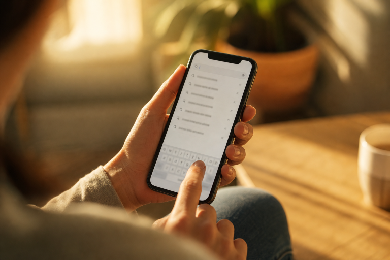
Before choosing a pattern, ask four questions:
- How often will people search instead of browse?
- Do they usually arrive with a specific goal?
- How large and varied is the searchable content set?
- Will hiding search save useful space or create friction?
Make the Search Field Easy to Use
Use a visible label or an accessible name, not placeholder text alone. Make the tap target comfortably large, use familiar wording such as “Search products” or “Search locations,” and include a clear button after text is entered. When a query has a predictable format, use the most appropriate keyboard. For example, a location field may benefit from location suggestions, while an order lookup may need a numeric keyboard.
Make the submit behavior obvious. If results update after each keystroke, show that change promptly. If people must press Search, use a clear keyboard action and button label. Avoid vague prompts that leave users wondering what they can search for.
Reduce Typing With Helpful Suggestions
Suggestions lower effort and help people express a useful query. Offer recent searches, common searches, popular categories, matching products or articles, spelling corrections, and related terms when they genuinely improve the next step.
Keep suggestion lists short enough to scan on a phone. Highlight matching text, let people remove recent searches, and do not fill valuable space with unrelated promotions. Search fields with dynamic suggestion lists should follow the keyboard and focus behavior of an accessible combobox, so people using assistive technology can understand, explore, accept, or dismiss options predictably.
Design Results for Fast Scanning
Keep the original query visible so users can refine it without starting over. Show a result count when it sets useful expectations, then put the most decision-making information first. Titles should be short and descriptive, while supporting details should help people compare choices, such as price, distance, availability, date, rating, or content type.
Use lists for text-heavy results and grids when images strongly influence the decision. Keep cards consistent, make the entire result easy to tap, and avoid stuffing each item with details that do not affect the choice.
Use Filters Without Creating a Maze
Filters help people narrow large result sets, but only when they match real decisions. Put the most useful options first, group related choices under plain-language headings, and show selected filters as removable chips. Users should always be able to remove one filter or reset everything.
Before adding a filter, confirm that it helps most people make a meaningful choice, can be understood without explanation, and has a sensible zero-result outcome. After a selection, update the results clearly so users know the filter took effect.
Handle Zero Results With Care
A blank screen that says “No results” ends the journey too early. Repeat the query so users can spot a typo, suggest a corrected spelling or related term, offer broader categories, and point out filters that may be excluding relevant items.
For example, a weak empty state says, “No results.” A useful version says, “No matches for ‘waterproof trail shoe’ with Size 9 selected,” then offers “View all trail shoes,” “Remove Size 9,” and “Try waterproof hiking boots.” Keep the field active so another attempt feels effortless.
Build Accessibility Into the Full Search Flow
Accessible search means more than adding a label. Use strong contrast, large touch targets, visible focus states, logical focus order, and text or icon cues that do not rely on color alone. Announce meaningful result updates when needed, and test with large text, zoom, reduced motion, screen readers, and alternative input methods.
Mobile accessibility should be treated as product quality from the beginning, consistent with the mobile accessibility guidance for responsive interfaces. A search experience that works under stress, on a small screen, and with assistive technology is usually clearer for everyone.
Use Clear Loading and Feedback States
Show that a request was received, especially when results take time to load. Keep the query visible, use a progress indicator when appropriate, and prevent older results from appearing current. If the connection fails, explain the problem in plain language and offer a retry action without forcing users to retype everything.
Plan for 2026 Search Behaviors
Natural-language queries, semantic matching, voice input, visual search, personalized ranking, and action-based results can make mobile search more capable. They are not automatic improvements. Each feature should solve a real user problem, explain its behavior clearly, and give people meaningful privacy and control choices.
A basic search that handles misspellings, synonyms, filters, and empty states well is more valuable than an advanced feature that produces unclear results.
Measure Whether Search Is Working
Track search usage, time to a useful result, zero-result rate, query reformulation, filter use, search exits, and completed tasks. Analytics reveals where people struggle. Usability testing explains why they struggle, whether the issue is unclear language, weak relevance, hidden controls, or a slow interface.
A Practical Mobile Search Review Checklist
- Search one-handed on a small phone.
- Try short, long, misspelled, and synonym-based queries.
- Apply multiple filters, then remove them individually.
- Trigger a zero-result state and test its recovery options.
- Test slow loading and an offline retry.
- Use keyboard navigation, a screen reader, Zoom, and large text.
Conclusion
Strong mobile search helps people move from intent to action with less effort. Make search easy to find, simple to enter, forgiving of mistakes, clear to refine, and useful even when the first query fails. The best experience is not necessarily the most complex one. It is the one that consistently helps people find the right thing fast.